Airtasker Rebrand
Founded over a decade ago, Airtasker’s brand was becoming stale and designers were finding their toolsets limiting. In a collaborative effort with Koto, an invigorating new brand direction and visual strategy was set, but it was ultimately up to the design team to translate and implement this into the product.
I led the overhaul of our design system, helped create the rebranded experience vision, and redesigned core product flows across web, iOS and Android.
Sep - Dec 2022
•
Product Designer
•
User Experience
•
Design System
The ambitious plan
In a tight 3 months we needed to define our rebranded product vision, redesign our app, website, and landing pages whilst simultaneously overhauling our design system.
Rebranding our entire product also came with significant risk to business metrics. While the new visual language brought life and energy into our brand, it was essential to balance our user’s expectations. For example, the loudness of our brand volume conveyed on our marketing billboards wouldn’t make sense for in-product experiences, where functionality was key.
Incremental approach
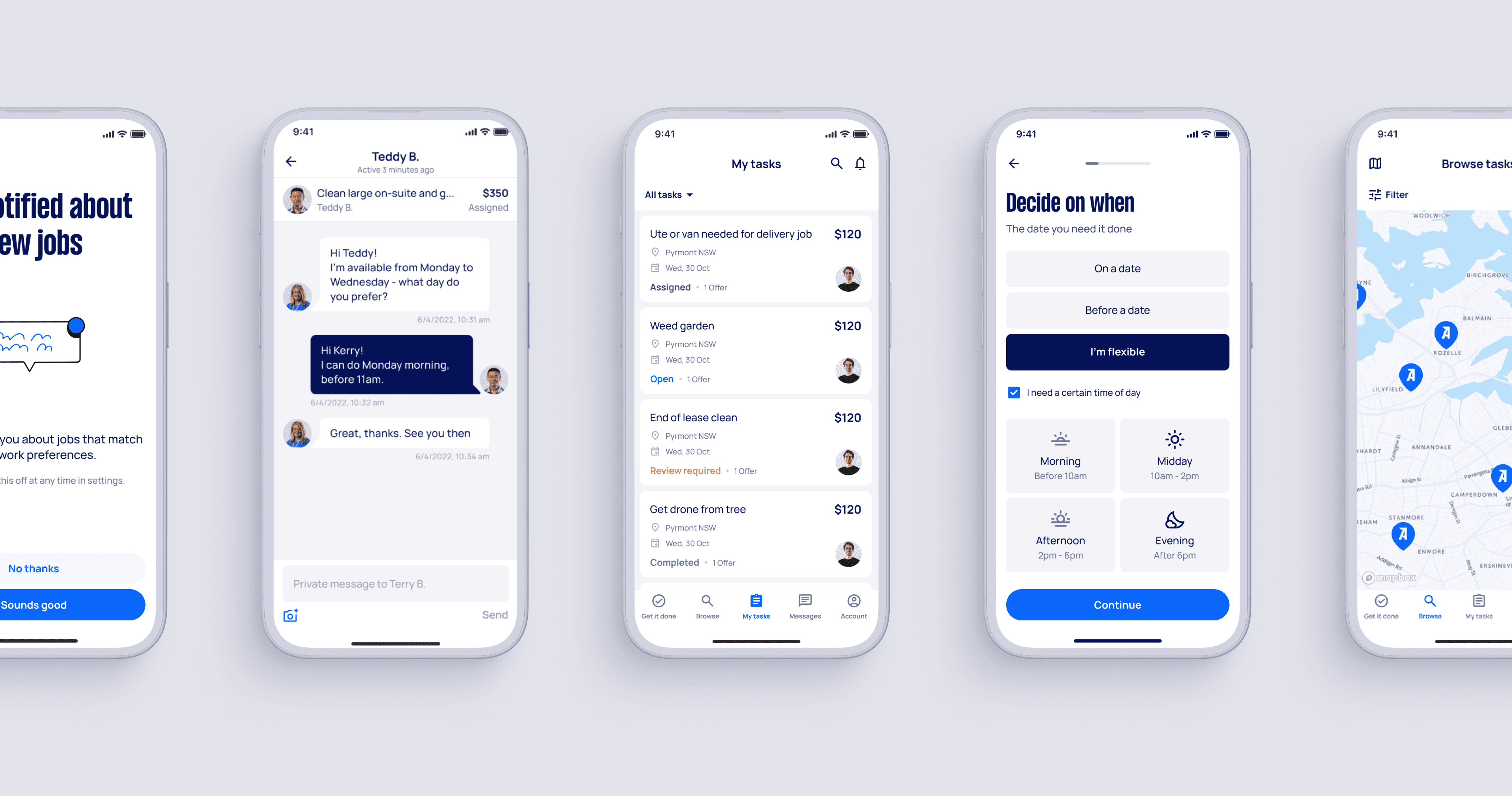
Engineering only had 6 weeks to implement so we prioritised incremental improvements to specific sections, components, and copy to visually uplift the product without compromising usability. Here, I was responsible for redesigning key screens of the app.
Design System overhaul
I heard from both designers and engineers that our old design system was “hard to use”. Components were frequently detached, engineers were confused, and parity issues compounded across the product.
We overhauled and simplified our design system, enough to ensure universal understanding of component behaviour and consistent cross-platform implementation. I rebuilt the components to be flexible across all use-cases while not inhibiting designers creatively.
I led the overhaul, helping conduct an audit, reworking majority of the components and documentation, and creating a new set of web landing page modules.
Don’t forget engineering
Close collaboration with engineering was crucial to ensure correct implementation. I engaged in regular discussions and shared Figma how-to recordings, which received positive feedback from engineers.
We also established a new handover step which required designers to review and approve every pull request, improving our cross-collaboration efficiency.
The launch
The massive cross-functional collaboration across the entire company and push to the end resulted in the rebrand being a massive success. Not only did we hit every deadline and launch on time, but we ended up with more done than initially planned. This included:
Redoing our entire design system of over 50 components, as well as developing a new set of landing page and email components.
Redesigning over 100 screens across all platforms.
Redesigning over 20 marketing landing pages.
Updating internal slide presentations and design tooling.
All-round uplifts
The rebrand saw no significant marketplace drops and a mixture of user feedback from praising the design as “clean and more intuitive”, to complaints like the app “still needs better UX”.
The new design system saw minimal detached components, significantly improved cross-platform consistency, and accelerated our overall shipping speed. It gained company-wide visibility, earning positive feedback from teams and stakeholders.
Valuable takeaways
Being the first rebrand I was part of and leading the design system overhaul, was an incredibly challenging but valuable project.
Alongside product work, I’ve since been in charge of updating and maintaining the design system as it continues to steadily evolve with new components and design tokens.


